1.4. How to view Visualization of the system output
We use foxglove to visualize our rosbags after using the visualizer.
You can download and install foxglove according to their instruction on their website.
Foxglove has also some tutorials how to use it on their website.
If you want to visualize any system output in 3d plot or onto an image, you need to first use the Creating Visualization for recorded Rosbags. Otherwise you can use foxglove to visualize ROS messages in 2d plots, as raw messages or simple stats directly.
You can view recorded rosbags in foxglove or connect to ROS live:
View recorded rosbags:
Windows and Ubuntu normally register foxglove as standard program for opening
*.bagfiles. Thus it should enough opening rosbags via double clicking in the system file viewer.Start foxglove and use the
Open local filebutton in the Welcome dialog.
Connect to ROS live:
Start foxglove and use the
Open connectionbutton in the Welcome dialog. Subsequently use ROS1 and enter theROS_MASTER_URI. In case, the ROS master is executed on the same machine,http://localhost:11311is already correct. If you want to connect to the ROS master on the ACU, see How to connect to the ACU to add the IP Adress of the ACU to your host names and usehttp://ACU:11311.If your setup does not allow you to connect to the port of the ROS system, you might want to use the foxglove websocket protocol or Rosbridge websocket protocol. Both are not prepared yet.
1.4.1. Layouts and Panels
Foxglove offers various panels to suitable visualize different types, e.g. a normal 2d plot, a map plot for GPS data or a 3d plot, see here.
Foxglove organizes those panels in so called layouts. The user can use multiple panels in a layout and switch between layouts with few clicks, see here.
We have prepared some layouts, e.g. for debugging the Monitoring or Mission Machine ROS Module. Those prepared layouts are saved in the repository under ./foxglove_Panels/ and can be imported into foxglove.
Obviously, you can prepare layouts youself and then export them and also save them in the specified repository for future use.
You can visualize nearly every data from ROS messages in panels like the raw messages panel or 2d plot.
If you want to have more powerful visualizations, you can use the Creating Visualization for recorded Rosbags. The visualizations of the visualizer will be explained in the following.
1.4.2. Visualizations of the Visualizer
The visualizer is used to:
Visualize ROS messages with informations expressed in coordinates, e.g. cone positions or planned path, in recorded images.
Create ROS messages with can be visualized in 3d plot of foxglove from ROS messages with informations expressed in coordinates, e.g. cone positions, planned path, current vehicle pose and driven path, in recorded images.
Migrate GPS ROS message from our GPS to a GPS ROS message, that can be visualized in foxglove, see
visualizer --gps
Thus, there are three panels which can sensibly visualize ROS messages created by the visualizer:
1.4.2.1. Image panel
You can choose one topic per image panel to be visualized.
/visualization/image, seevisualizer --image-visualizationVisualizes any available data from camera perception, slam, path planning, motion_planning and control onto recorded images.
Bounding boxes from camera perception (yellow, blue and orange rectangles around the cones, depending on the color of the perceived cone)
Tracked and estimated landmarks from SLAM (yellow, blue and orange circles according to the size of the cones, depending on the color of the estimated cone)
Future driven path from SLAM (teal, for comparison to the planned and predicted path, see below)
Centerpoints from path planning (green)
Planned path from motion planning (pink)
Predicted path from control (cyan)
/perception/detection_image, seevisualizer --generate-detection-imageVisualizes bounding boxes from camera perception onto recorded images.
1.4.2.2. 3d panel
One 3d panel can visualize all ROS Messages with compatible types, see its linked docs for more details.
One can decide which topics and namespaces should be visualized in a 3d panel, by opening its settings and toggle the visibility of the topics and their namespaces by clicking the eye next to it. The namespaces of the topics can be shown by expanding the topics with the triangle left of the topic.
The visualizer creates a lot of topics with compatible types, they will be described below and divided by the respective source AS ROS module.
The first bullet point layer will always describe the topic the compatible ROS messages are sent on. The second layer is optional and will describe the namespace, if applicable.
1.4.2.2.1. General
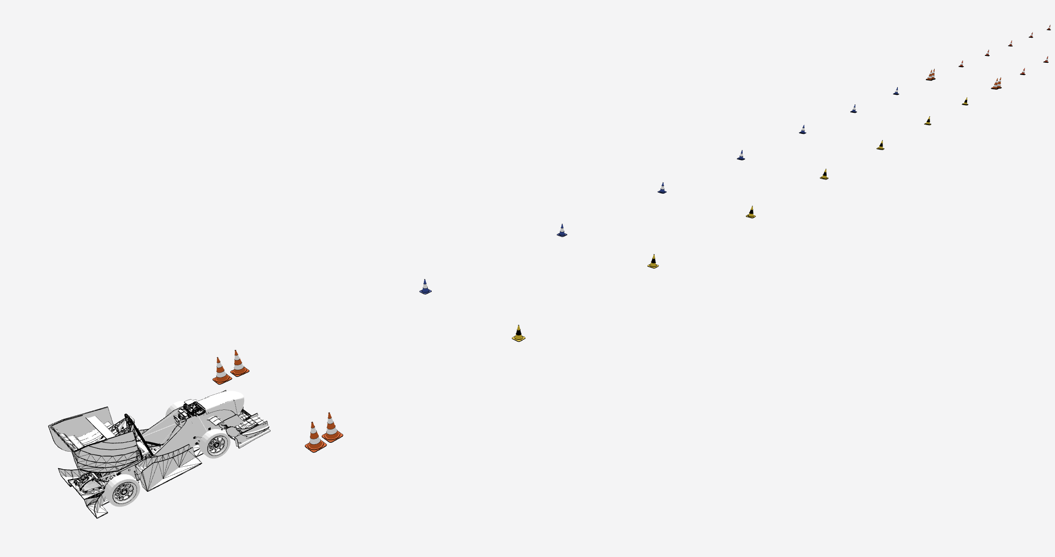
Fig. 1.5 General visualizations: ground truth and vehicle
/vehiclevehicleVisualizes vehicle pose according to transformation tree as 3d model of vehicle.
/visualization/ground_truthground_truth_mapVisualizes the ground truth of landmarks via 3d cone models. Ground truth has been creates by Creating Tracks from drone footage.
/gps/visualizationgpsVisualizes GPS position and heading including uncertainty via path, arrow and ellipse in map frame.
1.4.2.2.2. Local Mapping
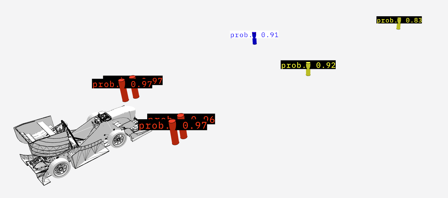
Fig. 1.6 Local Mapping visualizations: Vehicle with mapped cones and their probability
/local_mapping/visualizationlocal_mappingThe mapped cone positions by the local mapping for the respective cones perceived by the camera perception. Visualized as cylinder with the according color. Size of cylinder is orientated on real size of cones, but stretched by 1.5. (higher, but thinner).
local_mapping_probabilityProbablity that the mapped cone is of this color, derived by camera perception.
1.4.2.2.3. SLAM
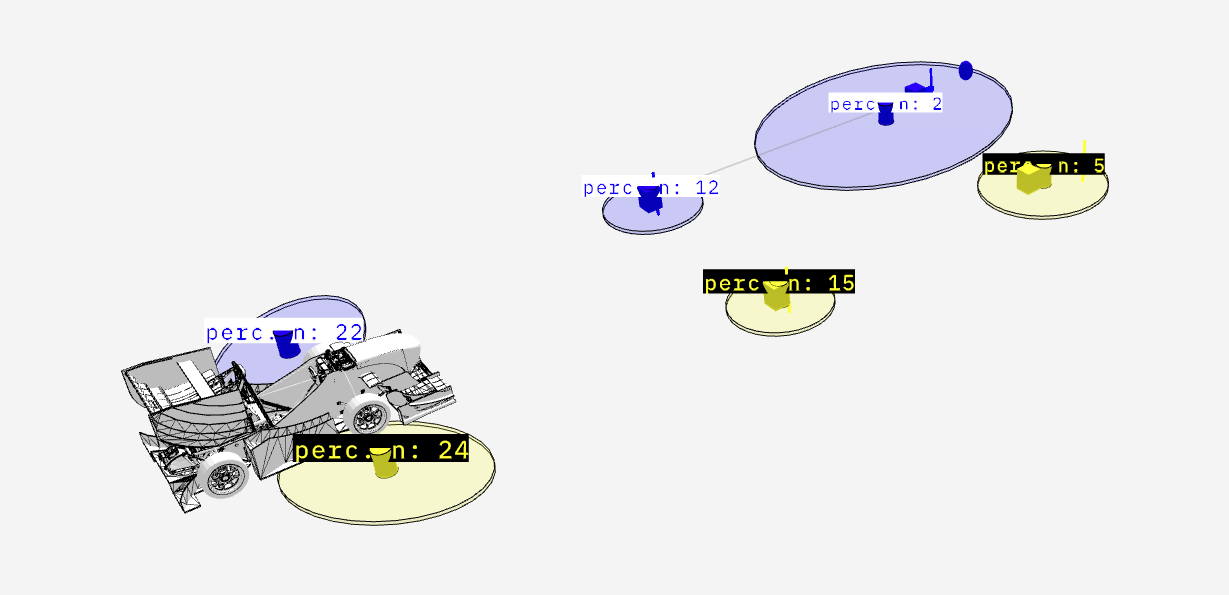
Fig. 1.7 SLAM landmark visualizations: Vehicle with tracked, observed, observable and predicted observed landmarks as well as their mapping and compatibility. Also the uncertainty and number of perception of the tracked landmarks.
/slam/landmarks/visualizationlandmark_mappingVisualizes which observed landmark has been associated with which observable landmark during data association during update step via an colored line according to the cone color between each associated pairing.
landmark_mapping_compatibilityVisualizes which observed landmarks are compatible with which observable landmarks according to color and mahalonobis distance via an thin, grey line between all compatible pairings.
landmarksVisualizes all tracked and estimated landmarks as cylinders according to cone color and cone size.
landmarks_perceived_nVisualizes how often tracked and estimated landmarks have been already perceived as text at the position of the landmark.
landmarks_uncertaintyVisualizes uncertainty for position of tracked and estimated landmarks by displaying an ellipse (with the according cone color) representing a number of standard deviation, default 1.
observable_landmarksVisualizes via colored cubes which estimated and tracked landmarks have been declared as theoretically observable by FoV gating.
observed_landmarksVisualizes via colored vertical lines which landmarks have been used and observed landmarks, after gating process (FoV and minimal probability).
predicted_observed_landmarkVisualizes via colored spheres where SLAM predicted the observed landmarks should be, based on the estimated and tracked landmarks, the data association and the vehicle position.
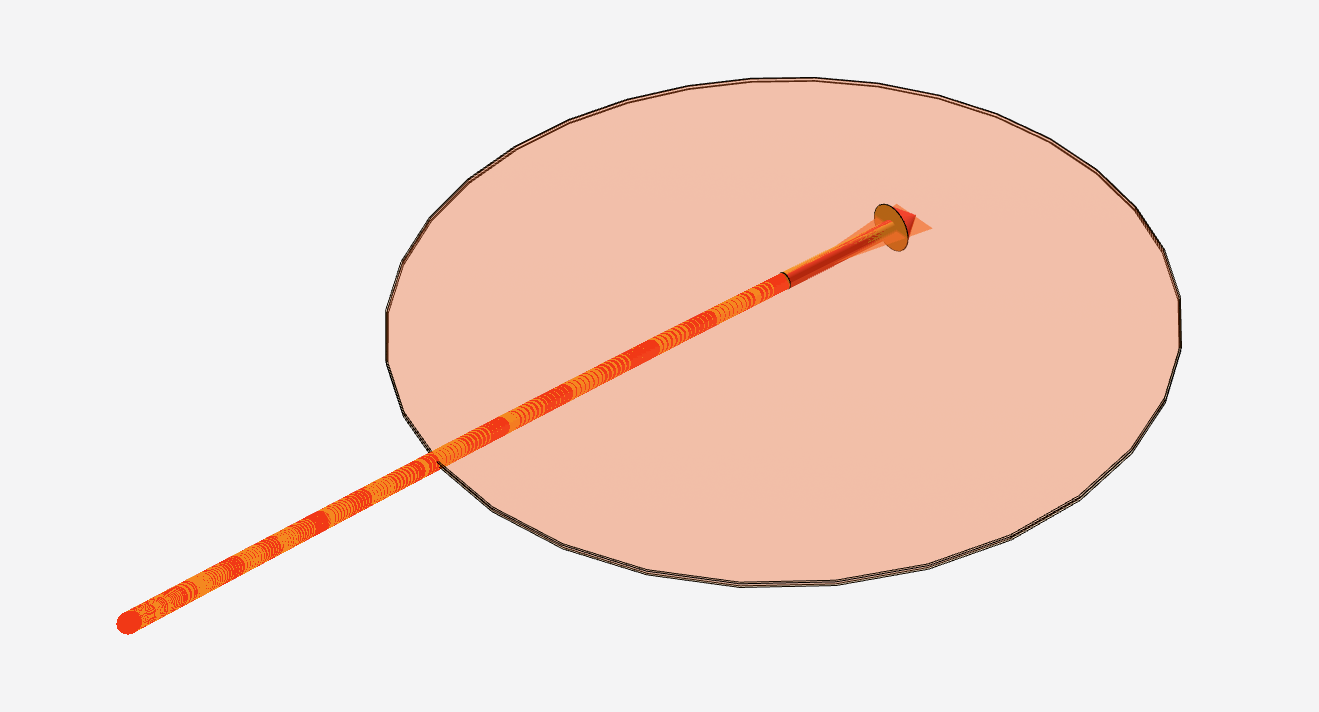
Fig. 1.8 SLAM vehicle poses visualizations: Current vehicle pose and its uncertainty and history for realtime (red) and main (orange) filter.
/slam/visualizationvehicle_poseVisualizes driven path via red line and current vehicle pose via red arrow estimated by
slam.SLAM.realtime_filter.vehicle_pose_uncertaintyVisualizes current vehicle position uncertainty via red ellipse representing a number of standard deviation (default 1) and current vehicle heading uncertainty via red triangle representing a number of standard deviation (default 1).
/slam/main/visualizationvehicle_pose_mainVisualizes driven path via orange line and current vehicle pose via orange arrow estimated by
slam.SLAM.realtime_filter.vehicle_pose_main_uncertaintyVisualizes current vehicle position uncertainty via orange ellipse representing a number of standard deviation (default 1) and current vehicle heading uncertainty via orange triangle representing a number of standard deviation (default 1).
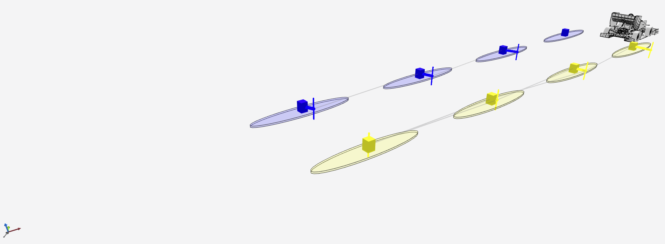
Fig. 1.9 SLAM map alignment visualizations: Debug informations for map alignment
/slam/map_alignment/visualizationmap_alignmentVisualizes translation of map alignment via grey arrow.
map_alignment_mappingVisualizes which observed landmark has been associated with which preloaded landmark by displaying colored line between the pairing.
map_alignment_mapping_compatibilityVisualizes compatible observed and observable landmarks by displaying thin grey lines between each pairing.
map_alignment_observable_landmark_uncertaintyVisualizes uncertainty of observable part of preloaded landmarks via colored ellipse representing a number of standard deviation (default 1).
map_alignment_observable_landmarkVisualizes observable part of preloaded landmarks via colored cubes.
map_alignment_observed_landmarkVisualizes estimated and tracked landmarks by
slam.SLAM.main_filter(gated by which should be used for map alignment) via colored verical lines.
/slam/map_alignment/transform_poseVisualizes translation and rotation of map alignment by displaying translated and rotated coordinate axis.
1.4.2.2.4. Finish Line Detection
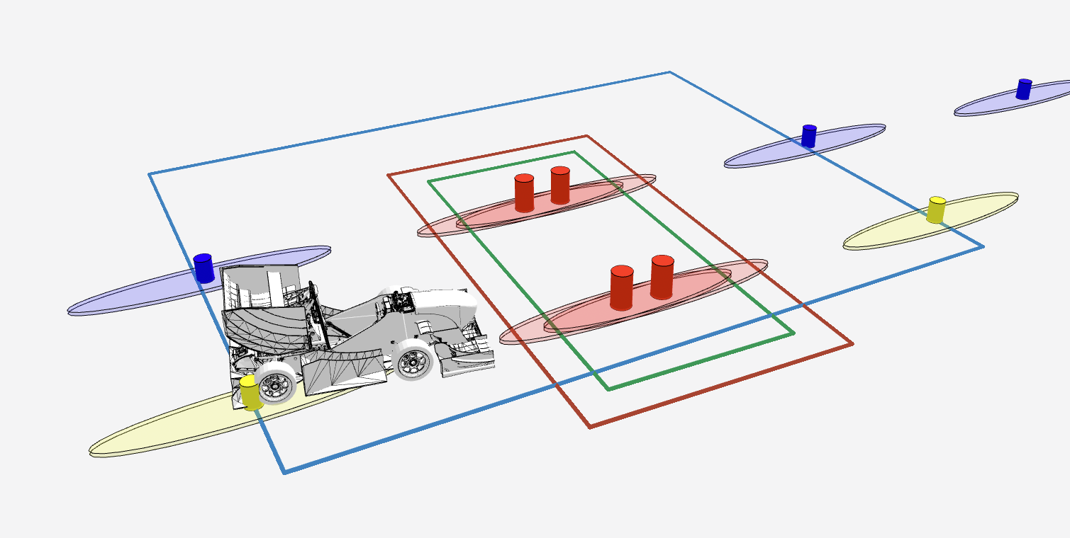
Fig. 1.10 Finish Line Detection visualizations: Search, enter and leave box for Finish Line Detection
/finish_line_detection/finish_line_boxfinish_line_detectionVisualizes enter (green) and leave (red) box of finish line (see
finish_line_detection) as rectangles.
/finish_line_detection/finish_line_search_boxfinish_line_detectionVisualizes search box for finish line cones (see
finish_line_detection) as blue rectangle.
1.4.2.2.5. Path Planning
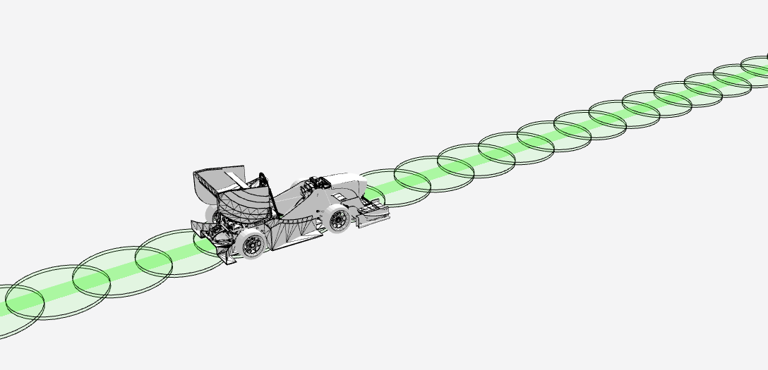
Fig. 1.11 Path Planning visualizations: Centerpoints of track and their respective width
/path_planning/visualizationcenterpointsVisualizes calculated centerpoints of track via green line.
centerpoints_widthVisualizes calculated width of centerpoints of track via green circles. Radius is equivalent to mean of left and right track width.
centerpoints_strategyVisualizes strategy of centerpoints of track via text boxes.
1.4.2.2.6. Motion Planning
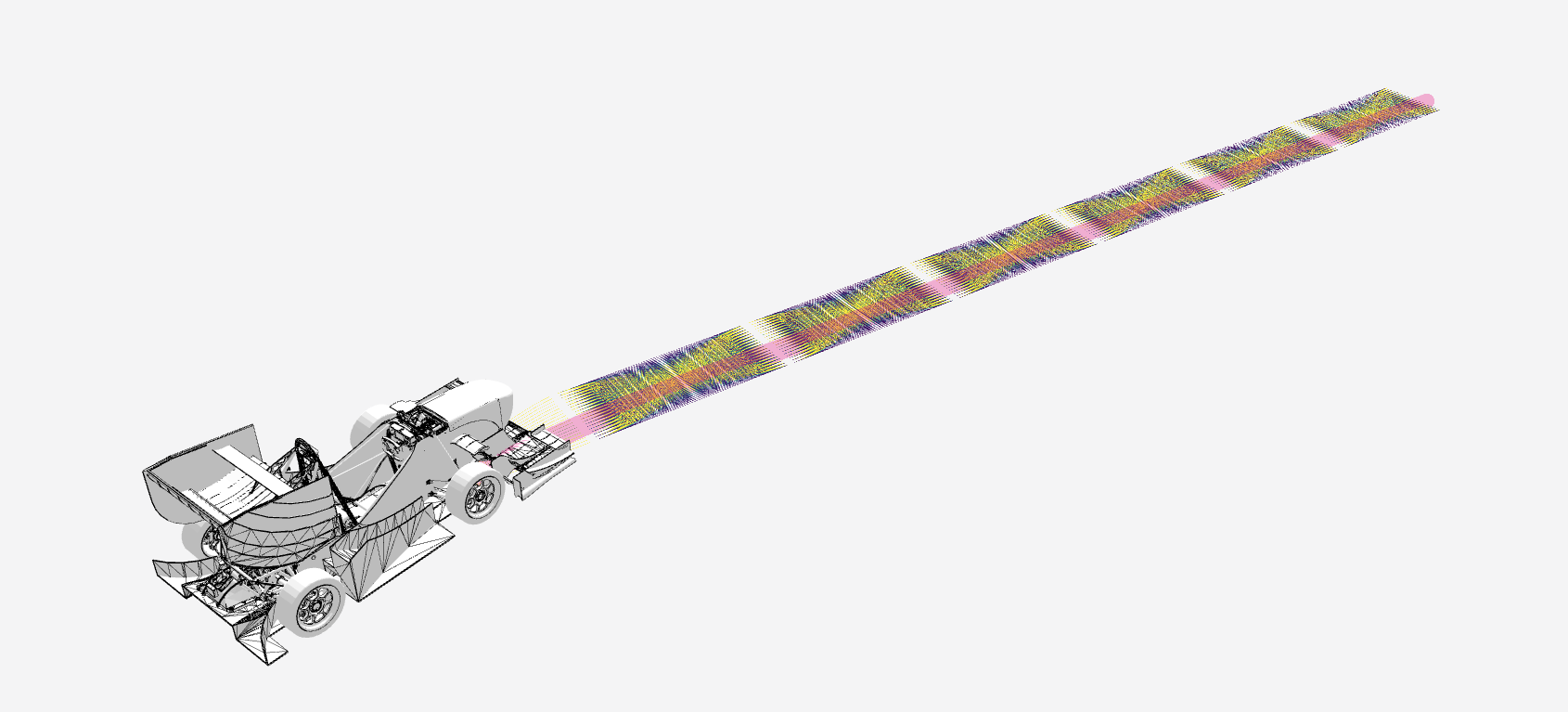
Fig. 1.12 Motion Planning visualizations: Planned path and slices of local motion planning.
/motion_planning/visualizationplanned_pathVisualizes planned path of planned trajectory via pink line.
/motion_planning/local/visualizationlocal_motion_planning_path_slicesVisualizes all slices of local motion planning via lines. Linea are colored according to the costs specified by
visualizer --local-motion-planning-color-scale.
1.4.2.2.7. Control
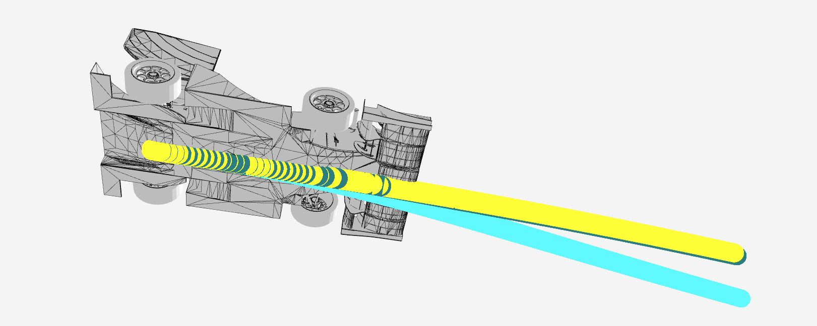
Fig. 1.13 Control visualizations: Predicted path by control and future driven path based on estimation from realtime and main filter from SLAM.
/control/visualizationpredicted_pathVisualizes the path control predicts the vehicle will drive in the future (default 1s) via a cyan line.
realtime_future_driven_pathVisualizes the path the vehicle will drive in the future according to the estimation of
slam.SLAM.realtime_filtervia a teal line.main_future_driven_pathVisualizes the path the vehicle will drive in the future according to the estimation of
slam.SLAM.main_filtervia a yellow line.
1.4.2.3. Map panel
The map panel automatically visualizes any data from ROS topics with ROS messages of the type sensor_msgs/NavSatFix.
Thus it visualizes migrated messages with the visualizer from the original /gps/gps topic